What Are Forex Price Charts And How to Use Them

A forex price chart is a visual or graphical representation of how the price of an asset or currency pair moves (or has moved) over a particular period. There are candlestick charts, lines, bar charts. They allow you to assess past and present market behaviour.
Let’s look at the major types of charts, share the advantages and possible limitations of each, and talk about how to interpret them:

1. Candlestick chart
Just like the name implies price information here is recorded and presented in the form/shape of a candle (a series of candles).

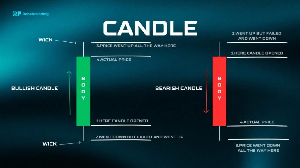
Each candle represents market activity (transactions) for a defined time. It is primarily made of a rectangular body and a wick or shadow.
The body can either be red or green. The wick (“the perpendicular line”) above and below the body is called upper and lower shadow/wick respectively.
(They show the high and low prices during the period).
More on a candlestick, the body becomes green when the close is higher than the opening price. This colour signifies that there are more buyers than sellers.
And a candle turns red in a situation where the closing price is lower than the open.
Benefits
a. It is easier to read and interpret because of the colours and its form.
b. It clearly displays the relationship between the open and close prices.
c. You can easily spot patterns, potential turning (reversal) points and speculate accordingly.
Limitation
a. It could take time to learn and master the various candlestick patterns.
2. Line chart
This is a single continuous line linking closing price points. It is very simple and straightforward. It helps you identify trends. It can also help you easily find and connect support and resistance levels.
The only problem is it does not provide a rich picture of what is going on in the market.
To interpret, simply look for the general direction of the line to determine if it’s moving upward (uptrend), downwards, or sideways.
Very pronounced slopes often mean strong buying or selling momentum.
3. Bar (OHLC) chart
Bar chart, also referred to as open-high-low-close (OHLC) charts is a vertical bar showing price ranges (highs & lows) of a period.
The height of a bar tells us about the level of volatility in a set time.
Taller bars equal wider trading ranges and more fluctuation. And when we see shorter bars we should know that price didn’t fluctuate much; that the market witnessed minimal dramatic moves.
Key parts:
Vertical line: The main vertical bar emerging from the low price to the high price of the period.
Left tick: This is a small horizontal dash projecting to the left of the main bar. It signals the opening price.
Right tick: The hash pointing to the right shows the level (price) at which the market closed.
Pros
It allows you to easily identify volatility patterns, ranges, dominance of buyers and sellers.
Disadvantage
It can be clustered sometimes, making it difficult to comprehend especially for beginners.
Note: Every chart has its purpose. Your choice should depend on your strategy and what you intend to achieve.
It is good practice to check more than one if you wish to have a comprehensive view of the market.
Which type of trading chart is most used for trading?
Candlestick chart is the most preferred by the majority. The reason is because it gives a better picture of price action compared to others.


